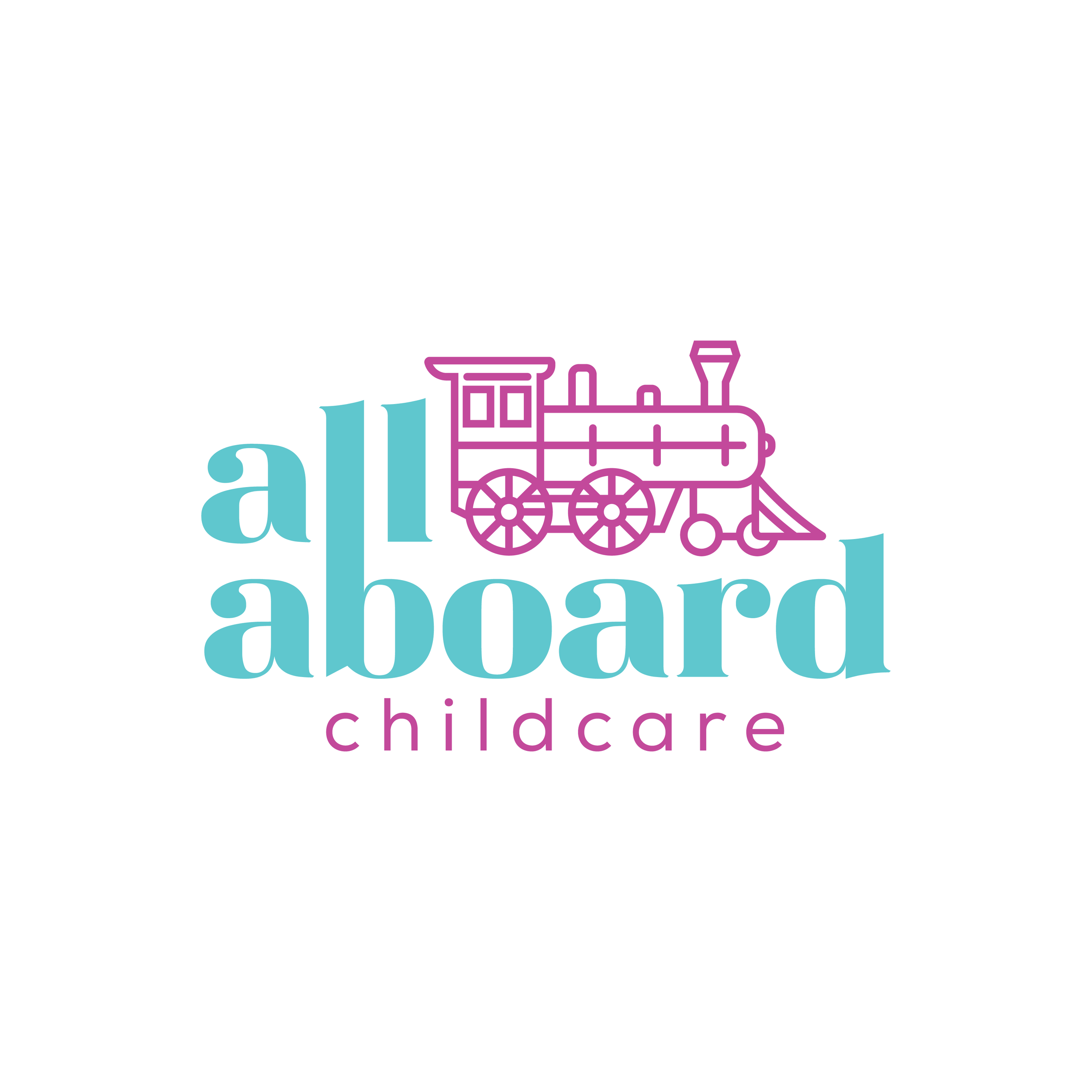
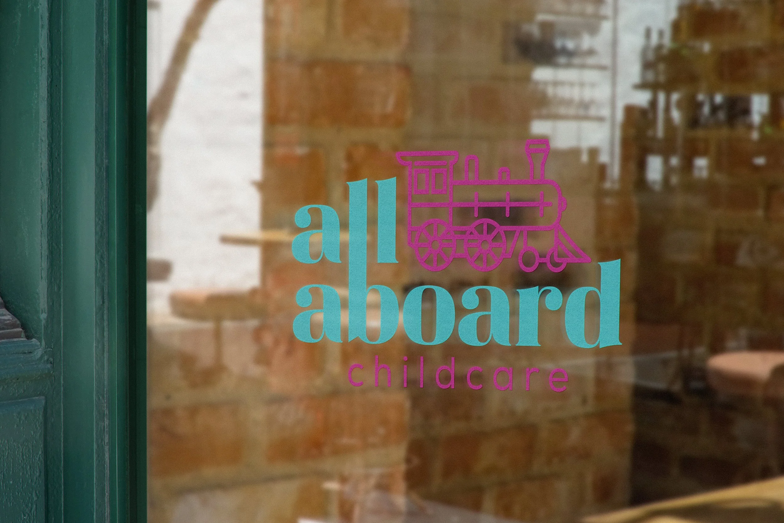
All Aboard Childcare
When designing this new branding for a Kamloops-based childcare facility, I wanted to do something fun that I thought would work for whatever child attends. I chose a train as the icon to focus on. It is a symbol we all recognize with wonder from our early developmental years. It also resonates with the business’ name. As so many other childcare facilities use blues and pinks to represent boys and girls, I wanted to use a colour scheme that doesn’t really fall to those norms. Instead, I opted for a teal with a balance of purple/pink as alternating colours in the branding. This proximity will allow those who fall within those norms to feel comfortable and those who don’t to also feel seen.