Barrhead chamber
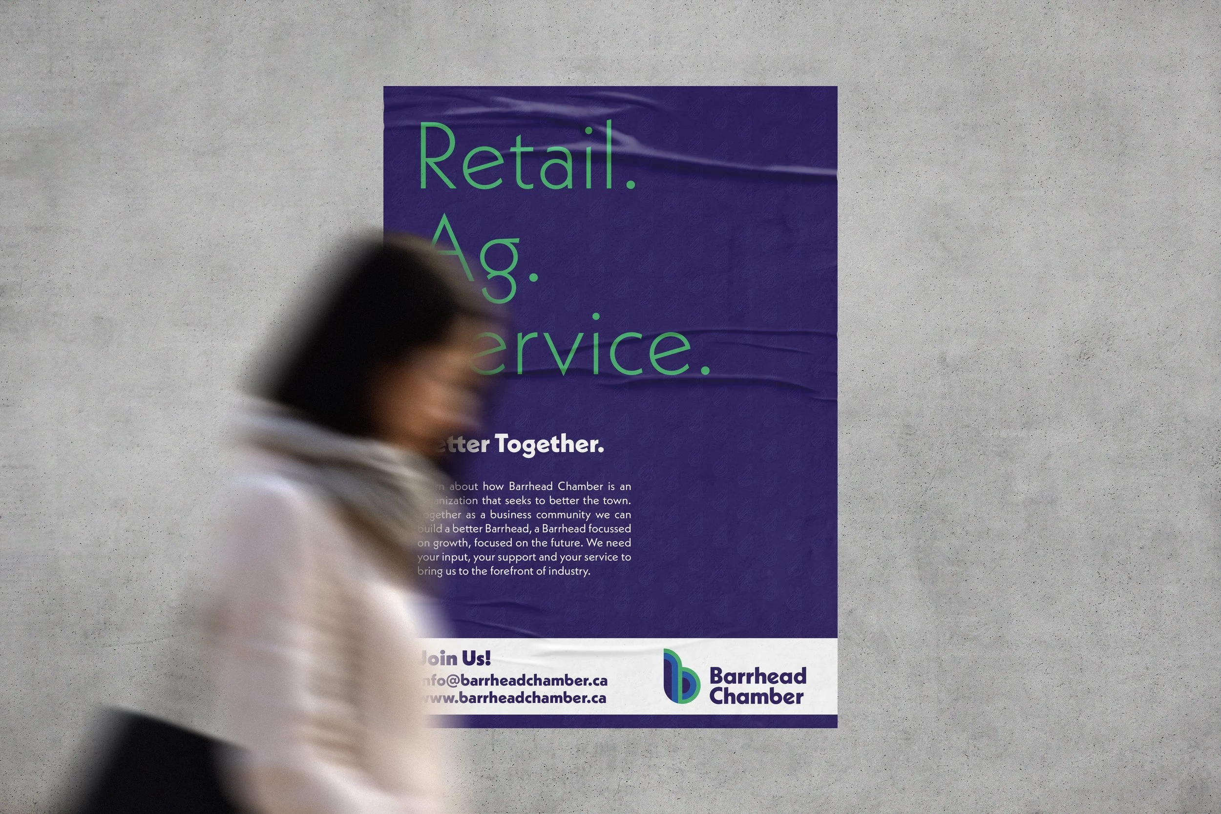
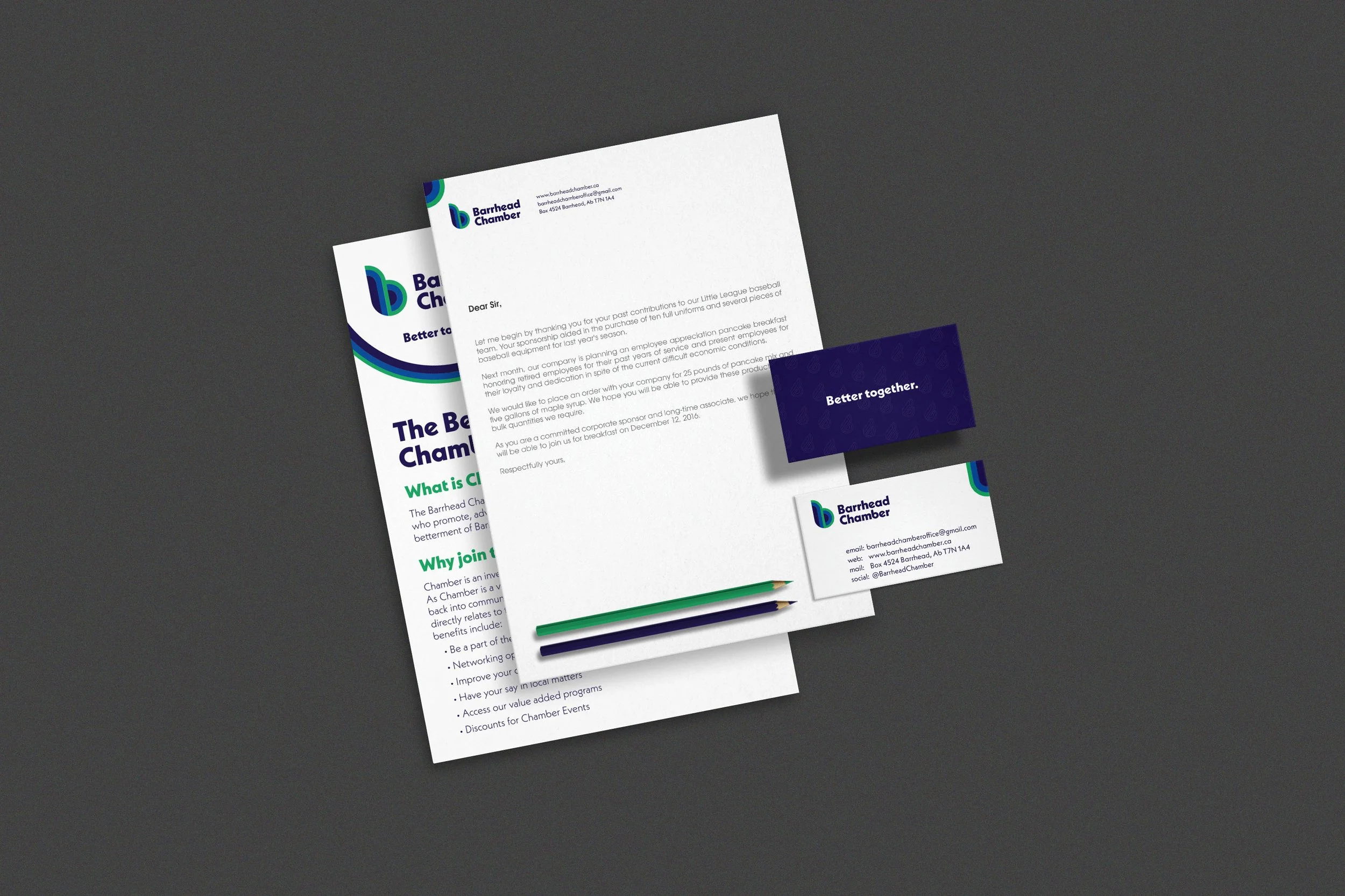
Barrhead and District Chamber of Commerce came to me looking for an update to their branding. Challenges that they had identified with the previous brand were that it felt clunky and hard to place. At small scale, it became illegible and the colours did not really stand out for such a prolific organization. Initially, I challenged them to drop the clunky name and change it to Barrhead Chamber. After consultation, the primary goal they decided they wanted to achieve with the rebrand was to celebrate the three pillars of the Barrhead Chamber; Service, Agriculture and Retail Industries. The icon developed followed a certain flow representing businesses putting the effort in at the top left, flowing down and eventually returning back to form a lower case b. Rounding out the branding, a cool colour palette and round geometric type is used to emphasize ideas of calmness and stability; qualities local businesses can rely on in their local Chamber of Commerce.