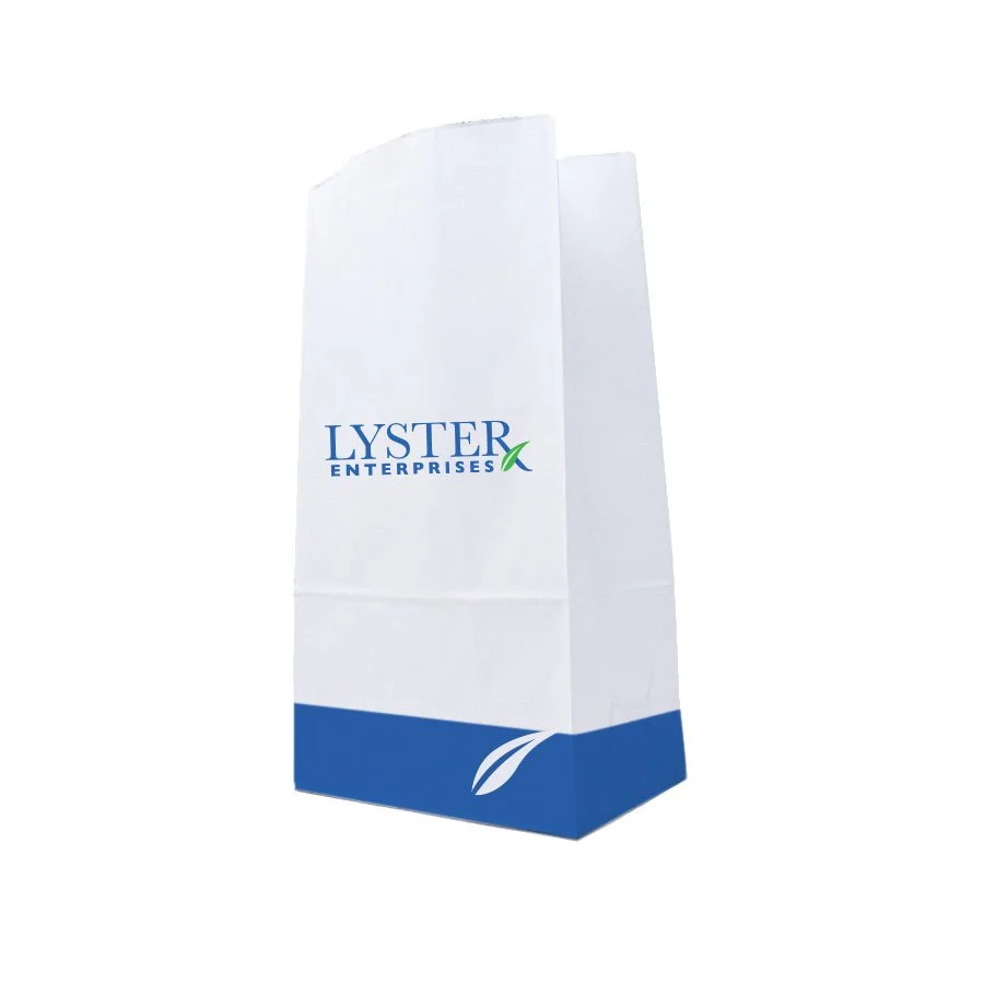
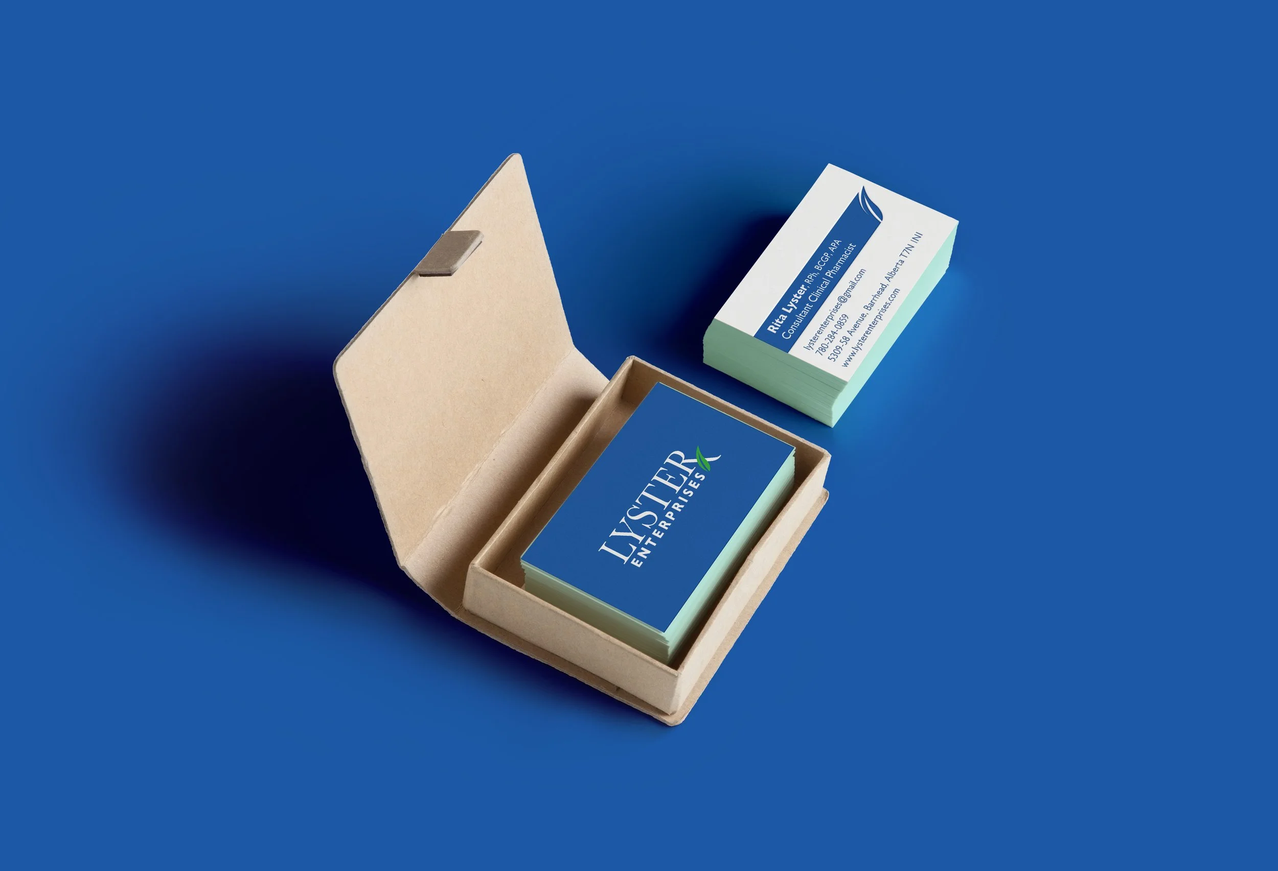
LYster enterprises
When receiving the brief from Lyster Enterprises, their ask was that the logo be professional yet welcoming. To achieve this, I used a serif font to project feelings of knowledge and academia. I wanted to emphasize to people that this is a pharmacy-related company and yet, stay away from the overly clinical, or predictable mortar and pestle or snake and rod. To do this, I extended the R and added a stylized leaf, presenting both the Rx of pharmacy and the natural form of a leaf. Using only cool colours in the logo presents the viewer with feelings of calmness and serenity to promote a feeling that they will be cared for.