ASTRAEA
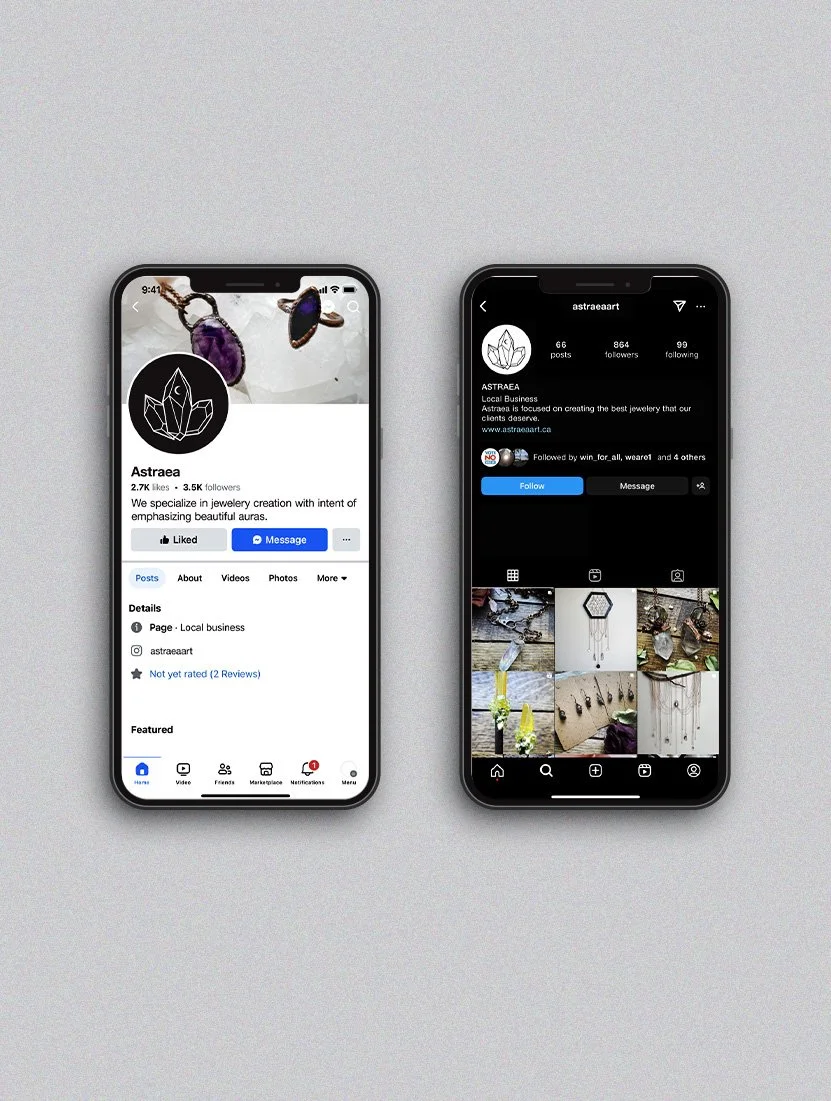
Astraea came to me looking for something that would look as great on paper as it would on a shirt. They had already established a logo in the form of type, so it was imperative that this both match and reinforce that. The other thing I was tasked with was incorporating a moon as well as the maple leaf, as they were a proud Canadian-based business. Since their business focused mainly on crystal jewelry, I asked “What if the maple leaf were made from crystals?” Through rigorous study and iterations, we came to this design that not only presents the form of both crystals and Canada, but uses different line weights like those found in an astrological chart.