prairie chef
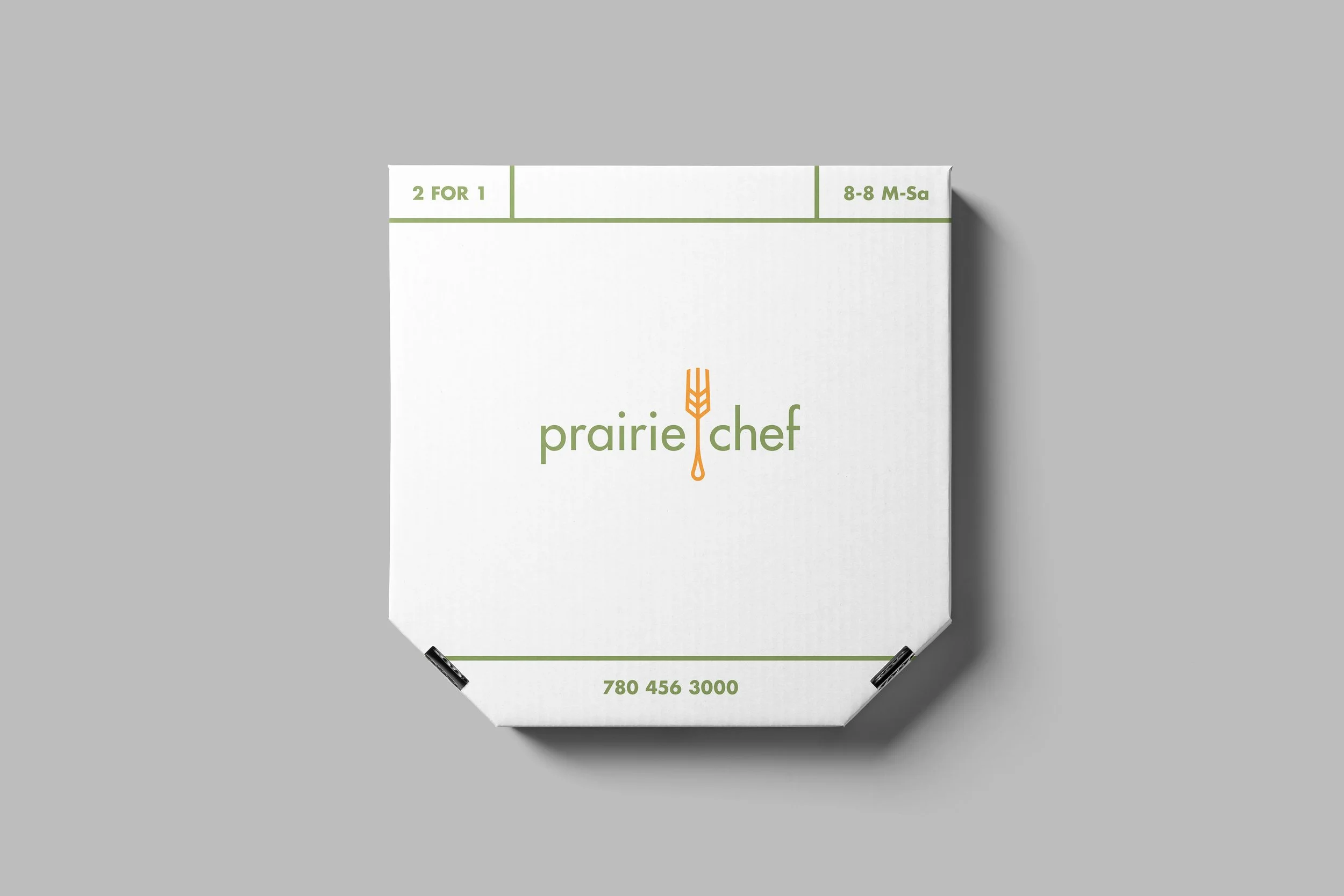
Prairie Chef was on the search for a rebrand that was clever, clean and professional. By combining the “prairie” of a wheat stalk and the “chef” of a fork, we came up with something that delivers both the clever and clean ideals. They also wanted to retain a home made feel. This was accomplished through the use of muted, earth toned colours. To emphasize the professional aspect of the rebrand, white space and clean typography were utilized. An issue that the client had addressed early on was that the type should be easy to read at small scale in their new menu. Futura was the perfect solution to this problem, as it has a clean professional look and is one of the most legible typefaces at a small scale.