Barrhead community adult learning
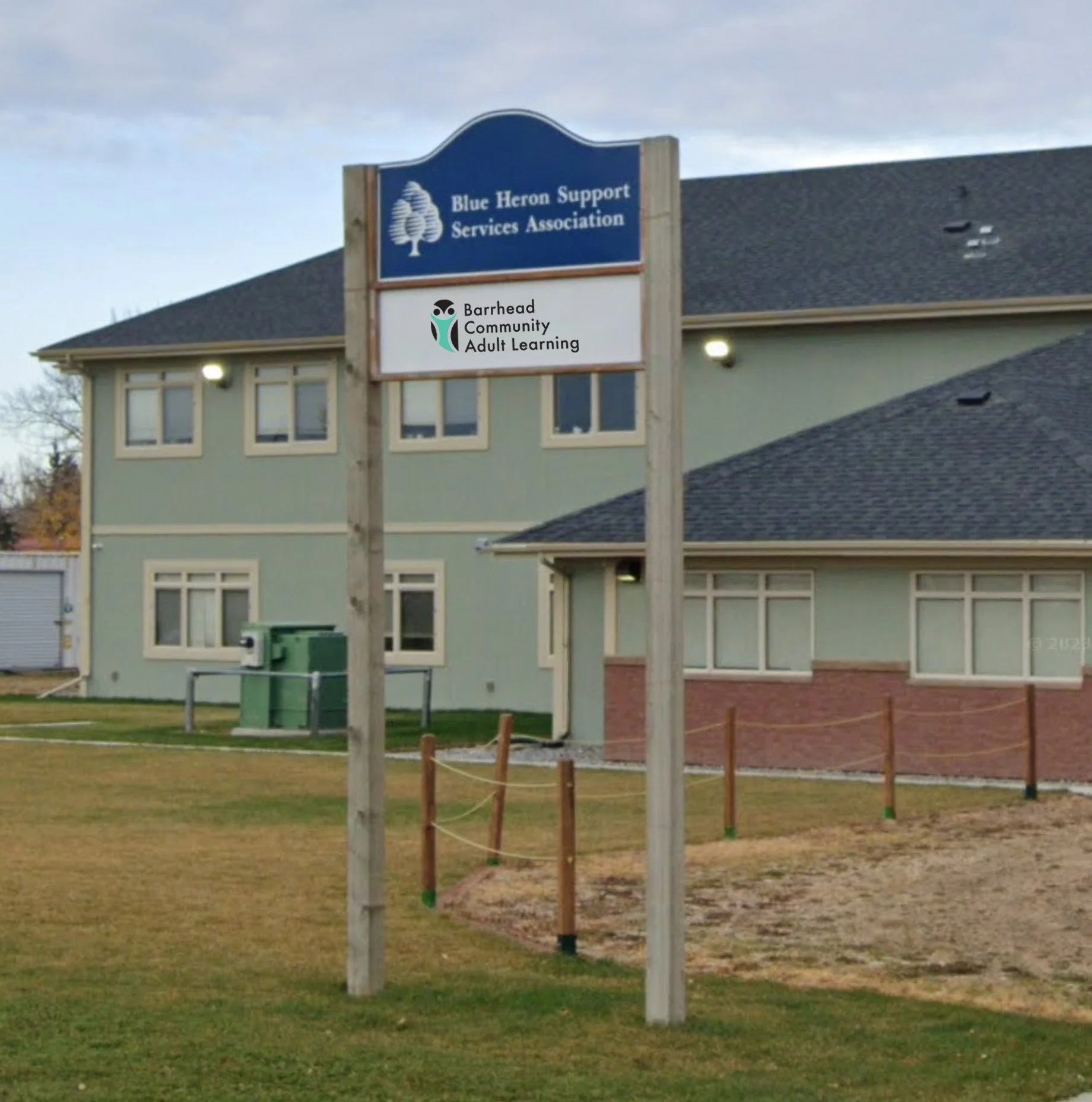
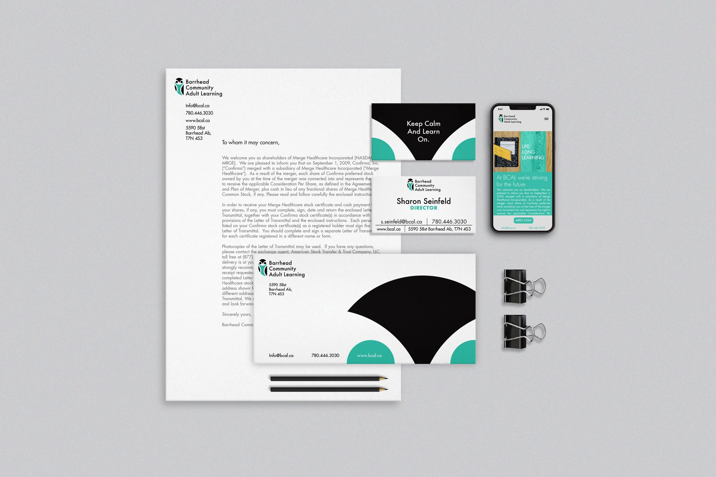
The folks over at Blue Heron Support Services Association (BHSSA) came to me after they had run a logo design contest to decide the logo of their new branch of Adult Learning. They had run into the problems most do when seeking out the help of enthusiasts; they had only received a small unscalable .jpeg and the chosen design was feeling ‘uninspired’. The Barrhead Community Adult Learning branding I developed for them uses an owl as an embodiment of Barrhead’s proximity with nature and the idea that wisdom comes from educating one's self further. Inside the owl, an hourglass shape, representing the ‘sands of time’, reflects the higher age range of the program's target audience. A strong, yet soft tone is created by the logo’s open concept and the impactful combination of shapes to create a whole image. The logo was created using primarily circles; a predominant element within the BHSSA logo, creating unity between the two brands.