barrhead united
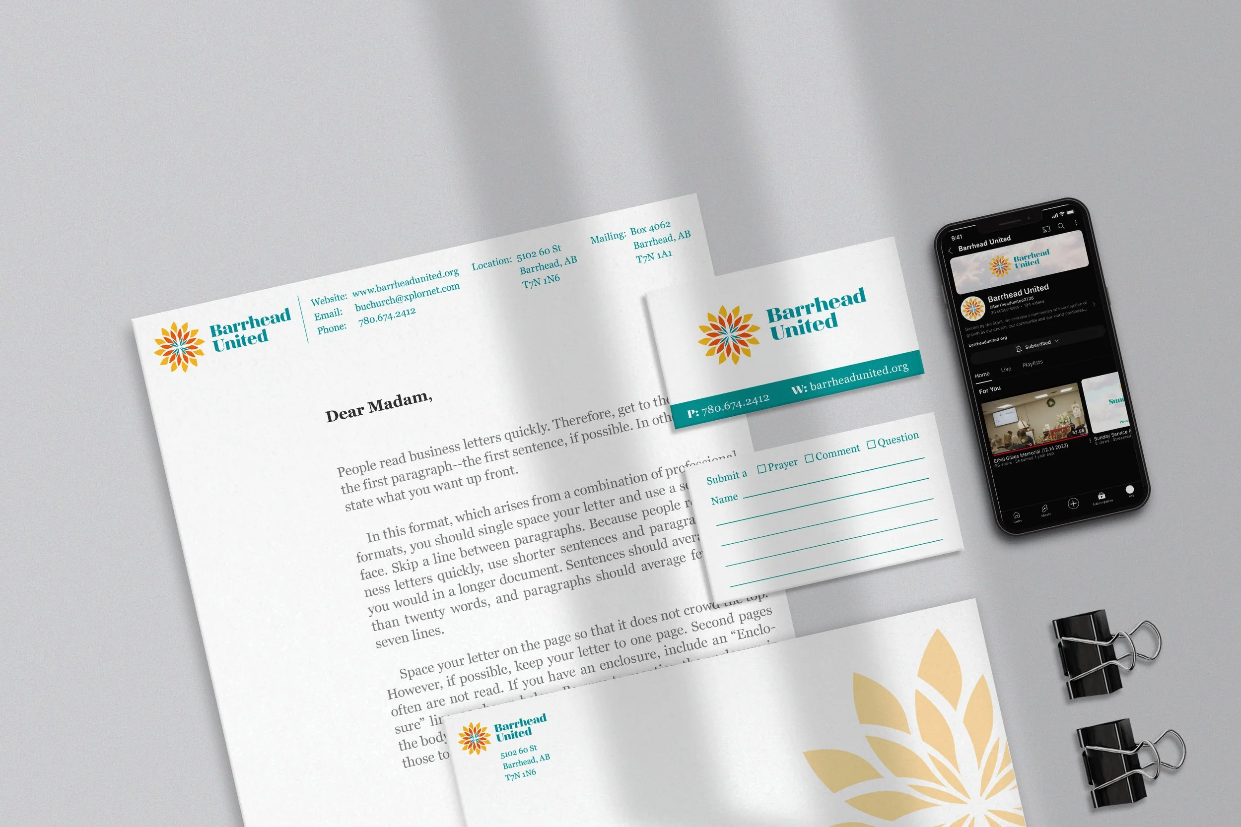
The branding for Barrhead United Church was a fresh process for them as they had only ever used a picture of their building as a logo. Talking with them, I discovered that their main focus was a faith-based community with emphasis on love. The logo form is based upon the feeling of Community that Barrhead United wanted to make the forefront of their brand. The initial idea stemmed from a sunflower; an image Barrhead United Church had been using for decades. A sunflower image has many parts and pieces that form a pattern coming together as one image. The motion of the logo form was made by utilizing outward growth of shapes from the centre and by rounding the outside corners to push negative space into the logo. A unique feature of the logo is the negative space in the centre creates a symbol of the organization's faith. The colour scheme of the logo helps to enforce the feelings of hope, optimism and love by its brightness radiating outward. Dark colours are used in the centre to symbolize passion as well as reinforce the negative space cross at the centre. The outward radiating colour scheme again projects both hope and optimism as well as reinforcing the religious aspect with ties back to the burning bush or the deep passion around the cross.